SaaS Instructional Design

Marketing an Instructional Design Solution

Project Overview

The instructional design branch of a SaaS company needed a new website. My team and I researched, strategized, designed, and built a modern and trendy website for the client.

User Persona & Research

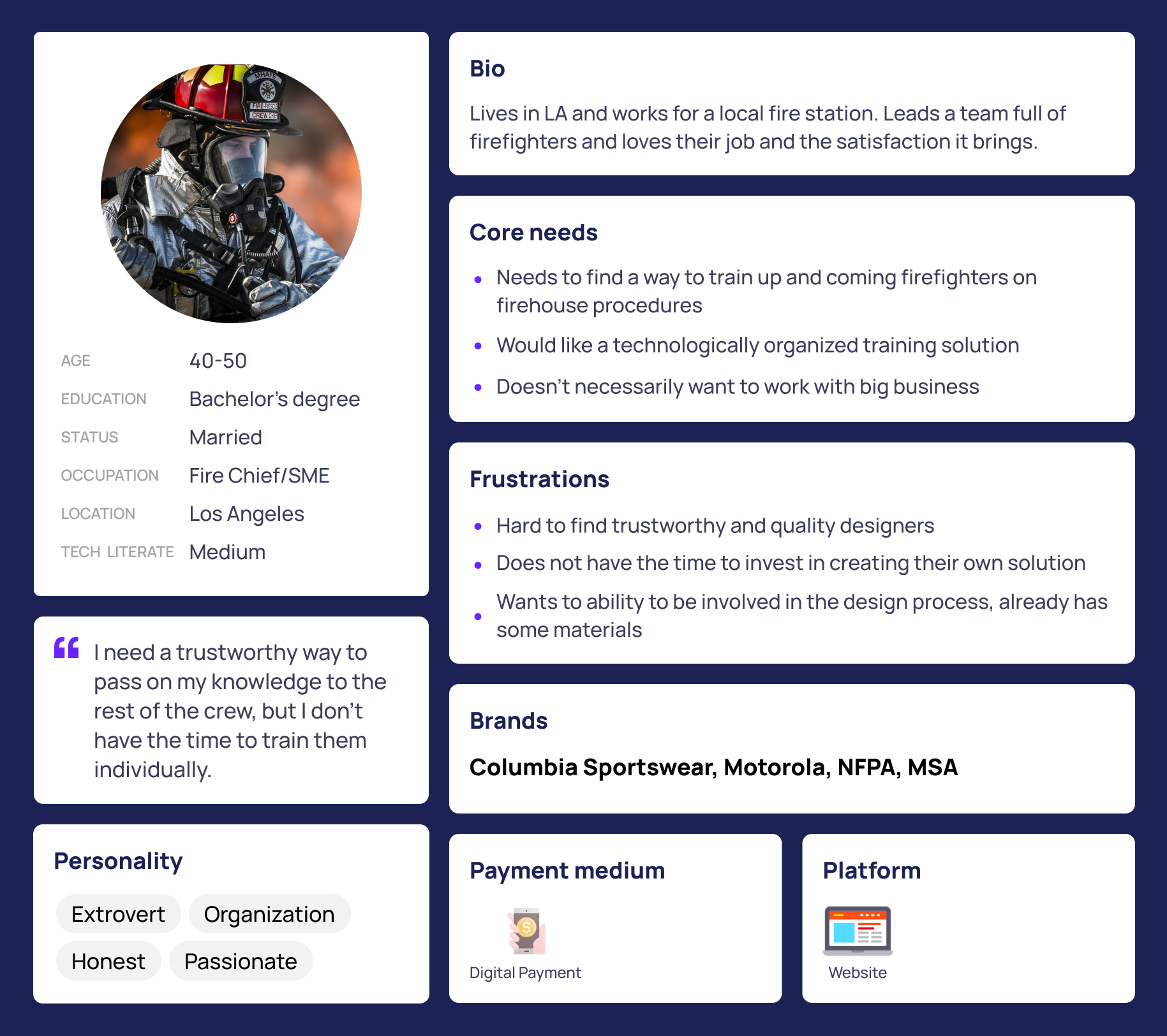
We wanted to form a deeper understanding of our users' goals, needs, experiences, and behaviors. So we created a persona of the optimal customer for the site. Understanding a user's needs and pain points allowed us to create a more enjoyable and satisfying design. In this case, the primary user problem was creating a training solution that is both easy to manage and effective, and doing so within the constraints of a busy schedule.

Researched User Persona

After talking with our client and doing our own research, we decided the best experience on the website would be a short and sweet journey through the case studies with additional resources available if users were interested. An overly bloated website with obvious and loud marketing sections would not be helpful for the brand image and customer experience.

SEO Research

In addition to design and strategy research, we conducted several weeks of SEO research. This included researching best practices for on page and off page SEO and extensive keyword finding.

Used Google Keyword Planner and the popular statistical program, R.

Found the most popular keywords used across competitors and analyzed overlapping words.

We came up with about 80 words across two relevant industries for our client's copywriters.

Wireframes

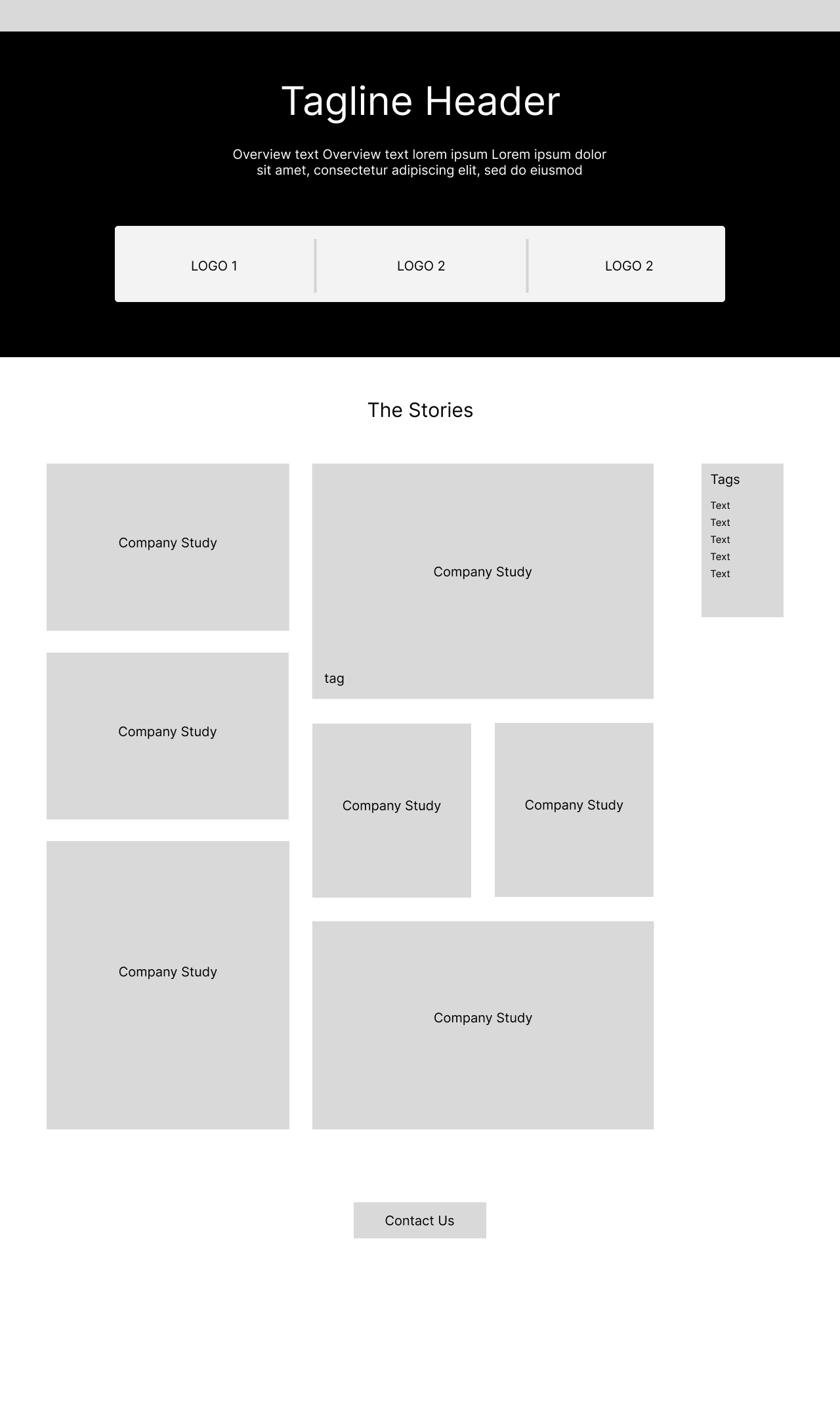
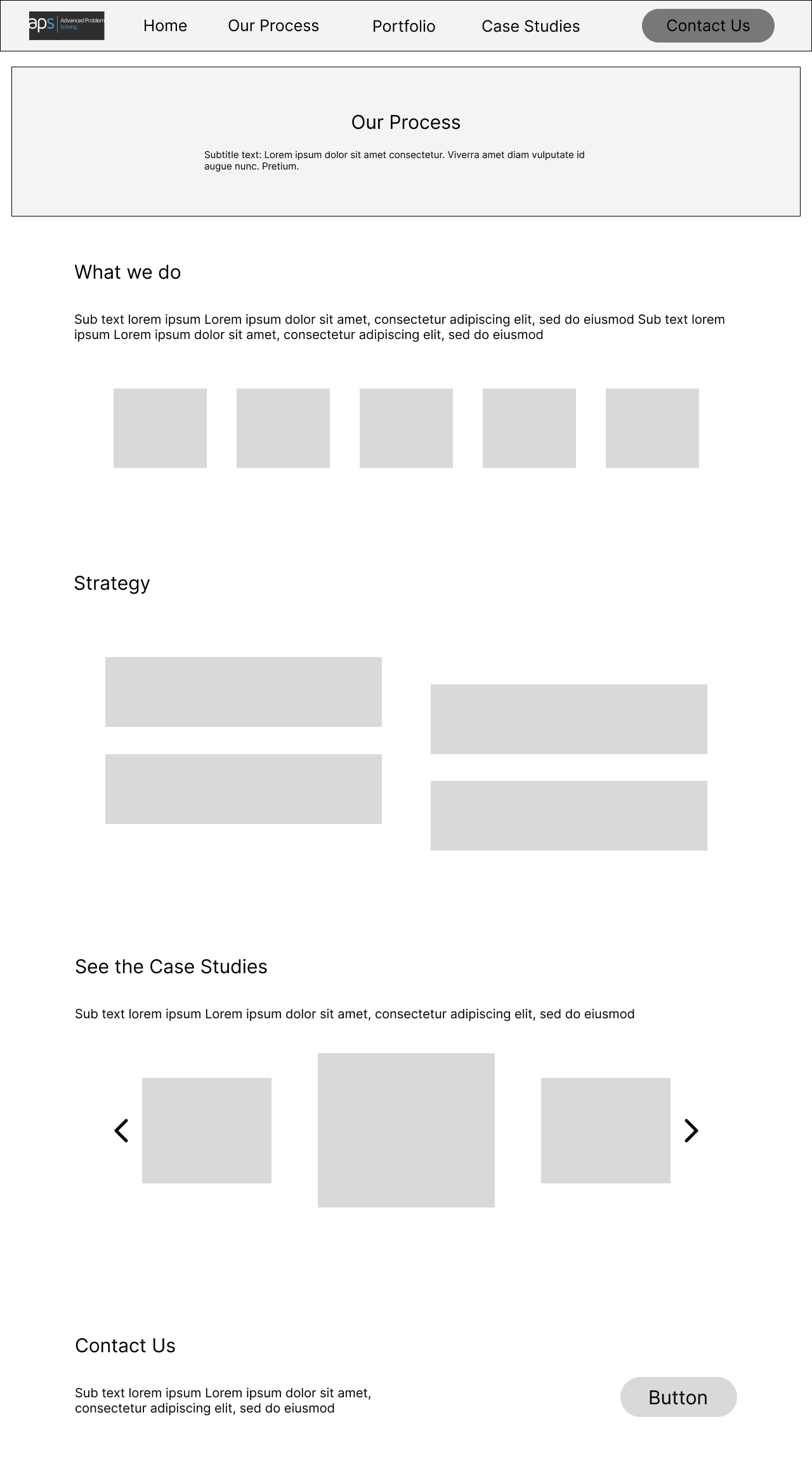
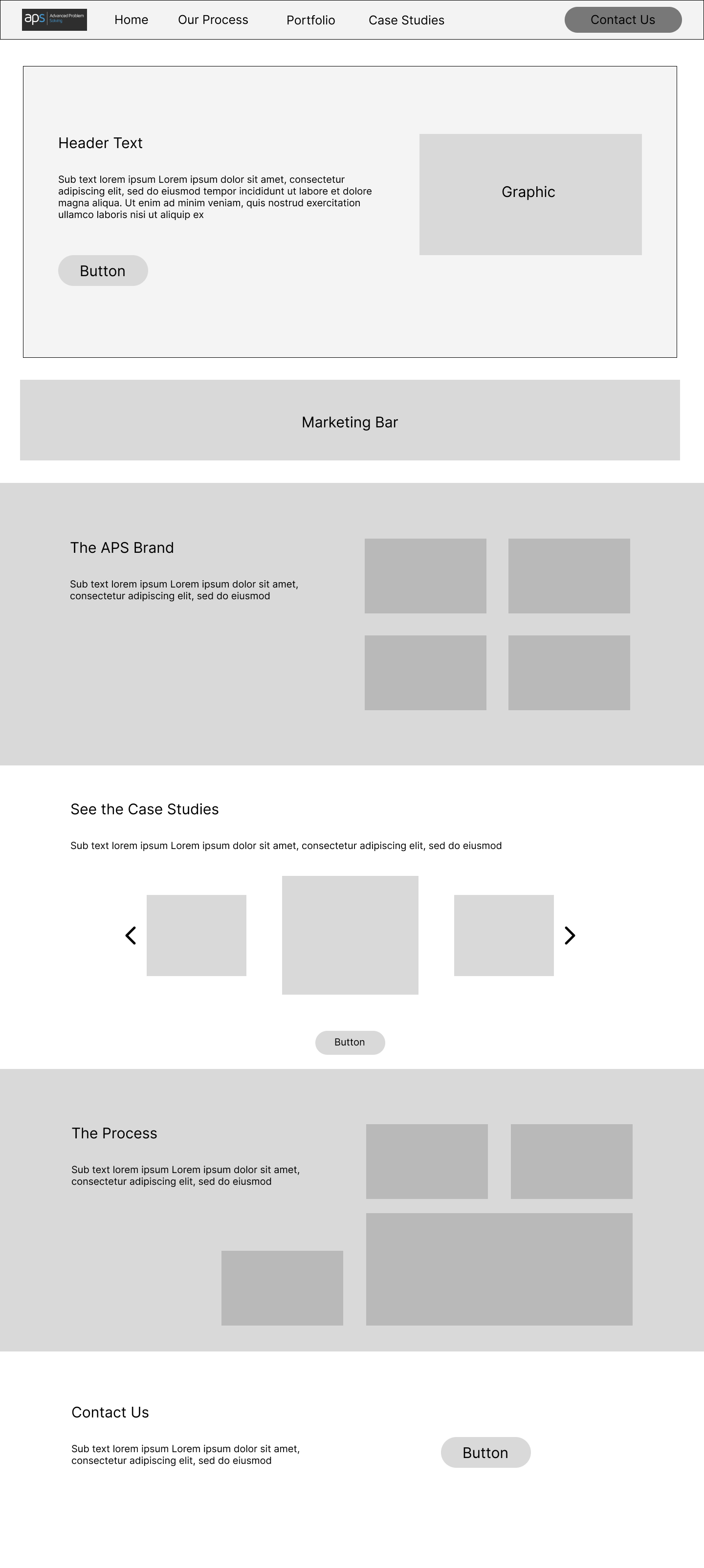
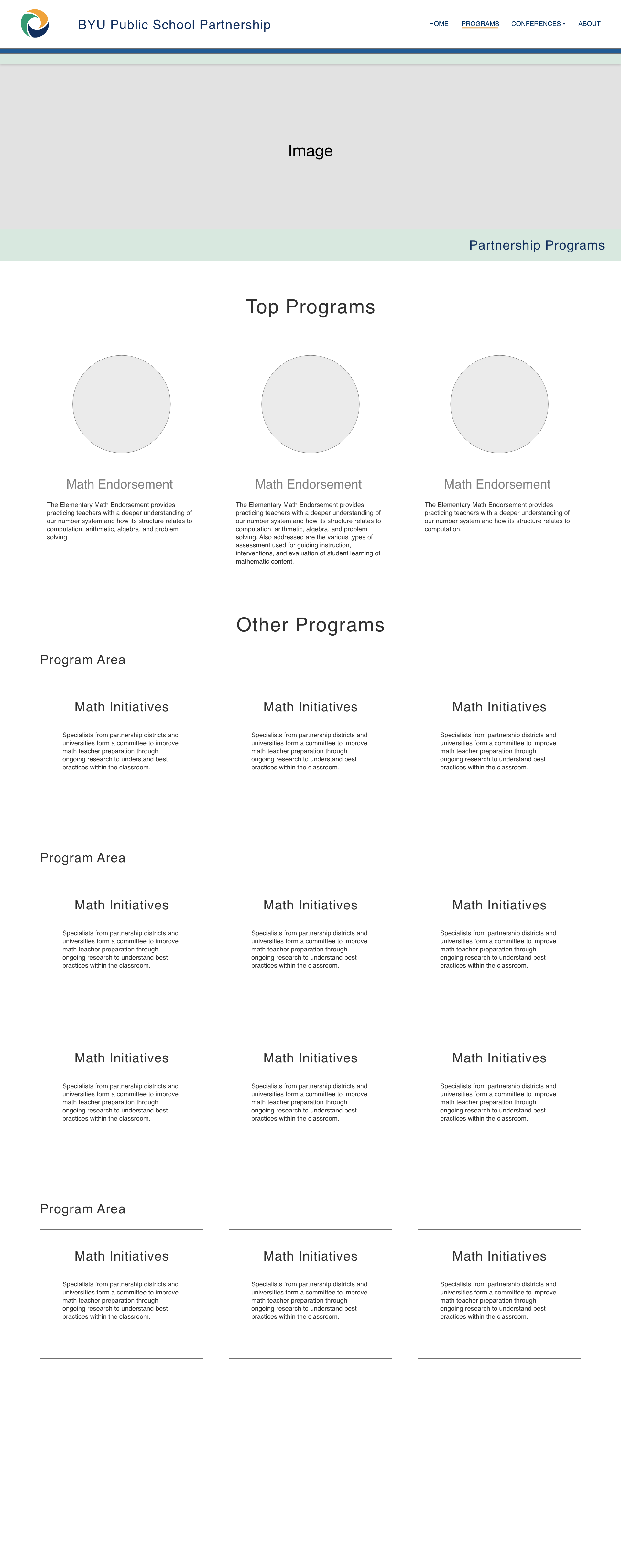
Once we got our strategy formulated, we moved onto designing our prototypes. Some of these early wireframes were heavily based on our competitive analysis and the structures of other similar websites. We emphasized the case studies in order to influence the user journey, with a simple banner structure to keep in line with the principle of Jakob's law and our competitive analysis.

Programs page wireframe
Program content page wireframe
Endorsement content wireframe

UI Design

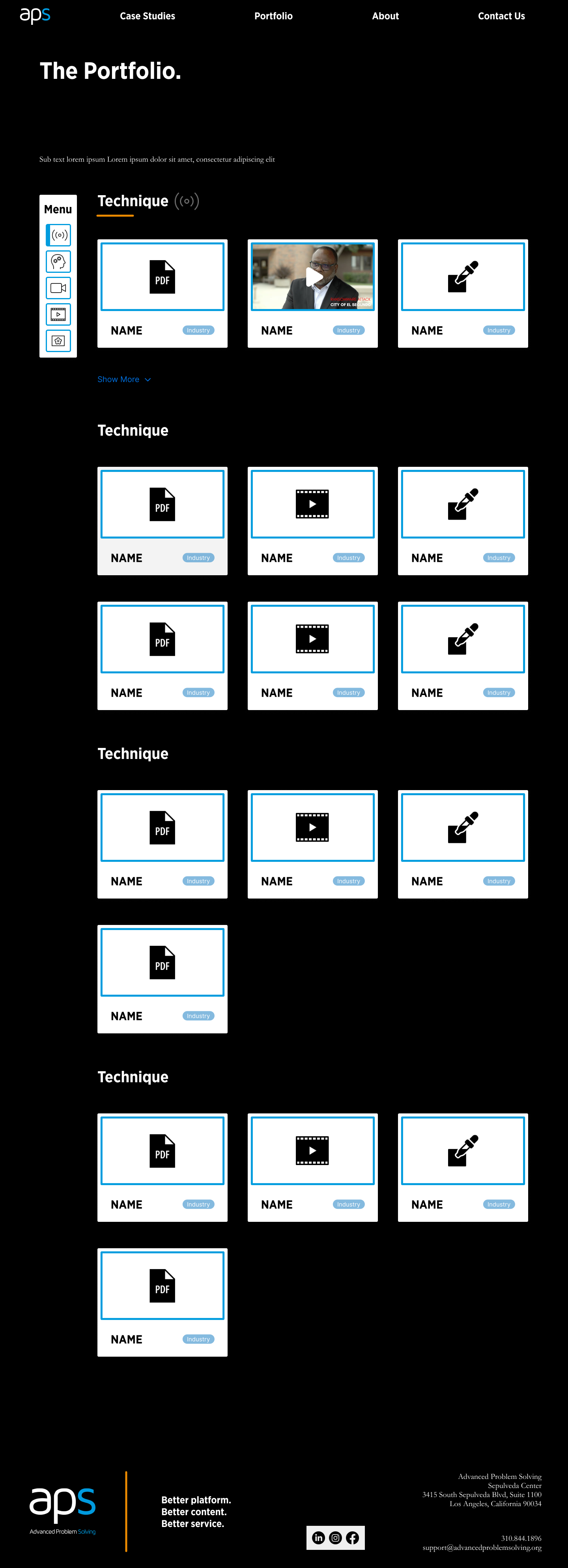
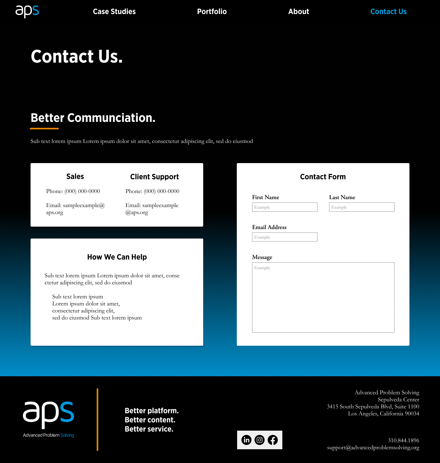
After presenting our wireframes and strategy to the company executives and getting approval, we moved forward into the design phase with our wireframes. Design highlights:

A dark background with smaller elements using our client's brand colors.

Gradient usage to connect with potential users who may often see gradients.

Given their business to business model, we designed primarily for desktop.

Home Page Finished
Programs Page
Endorsement content

Learnings

This project helped me learn more about two vital UX skills: client communication and new product strategy and design. Compromising with the client was important in this project, especially because they knew more about their potential customers than I did. I was able to learn more about the balance between voicing concerns and backing up my position and acknowledging the expertise of our client. I also got insight into the strategy and design of a new product and the nuances that come with journey mapping and fitting business goals into a tangible product.

Programs page wireframe